Natasha Fee Communications
Client: Natasha Fee Communications
Natasha Fee is an accomplished communications professional with an already existing, but not formally branded, consultancy. She needed a polished brand identity to legitimize what she's already been doing, something with a bit of fun and approachability to attract the sorts of clients she'd love to work with going forward. I was so excited to hear Natasha's vision for this brand: bright colors, an emphasis on creativity, and best of all, a custom illustration of a sculpture bust.

Brand Personality
- Professional
- Creative
- Approachable
- Modern
- Fun
These personality keywords guided the look and feel of the Natasha Fee Communications brand design. Natasha is looking to work with creative, open-minded, and mission-driven small teams. The brand needed to reflect their quirky, approachable, arts & culture related, and fun personalities.
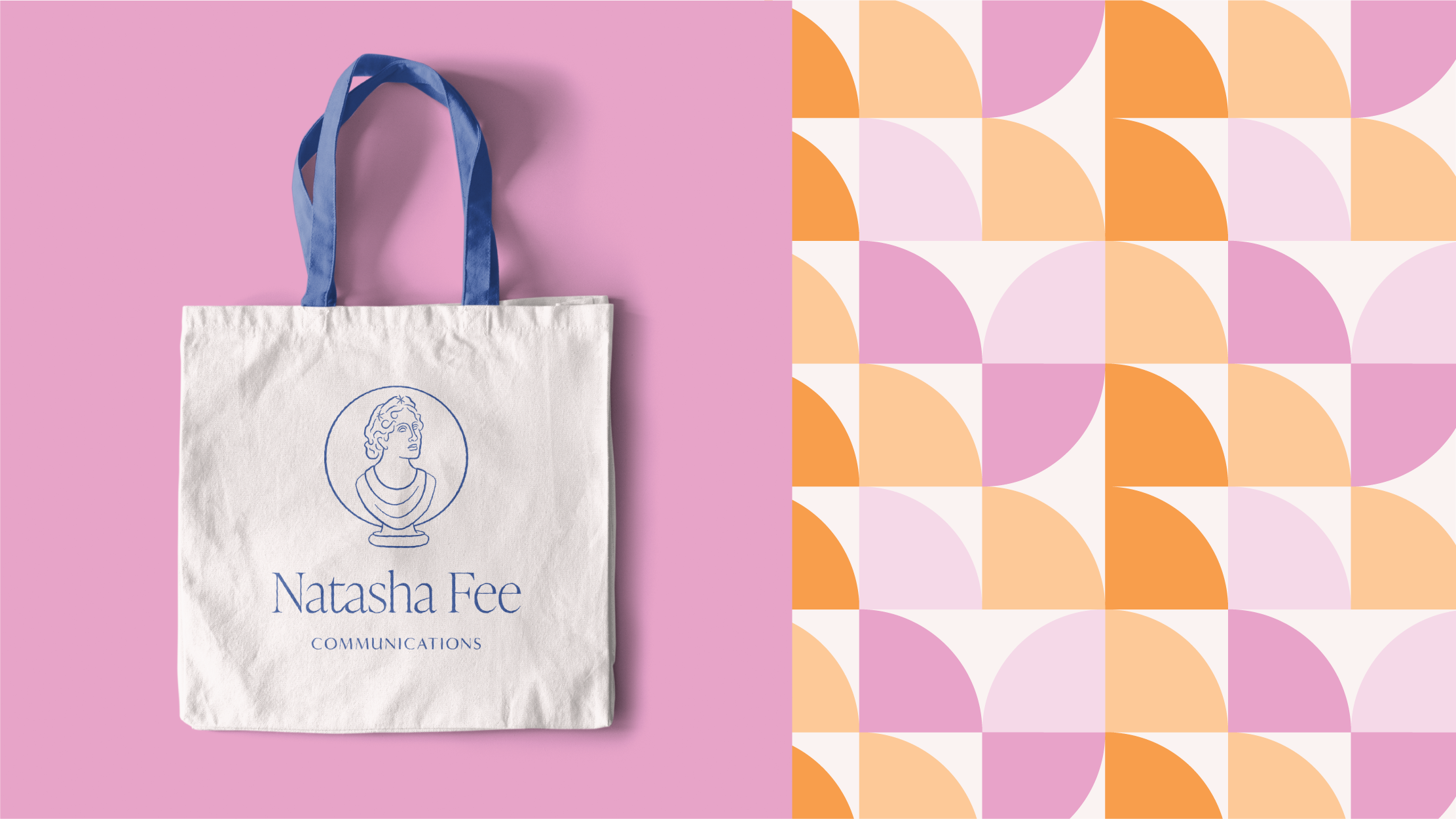
The star of the final logo system is a custom illustration of a sculpture bust, Natasha’s main request for the logo design. For added meaning, the illustration is loosely based on a sculpture by Gaetano Matteo Monti: “Iris as goddess of the rainbow” at the Kunsthistorisches Museum in Vienna, Austria. Iris’ name contains a double meaning, being connected with both the Greek word iris “the rainbow” and eiris “messenger.” As a messenger of the Olympian gods, she is a natural fit for the field of communications.
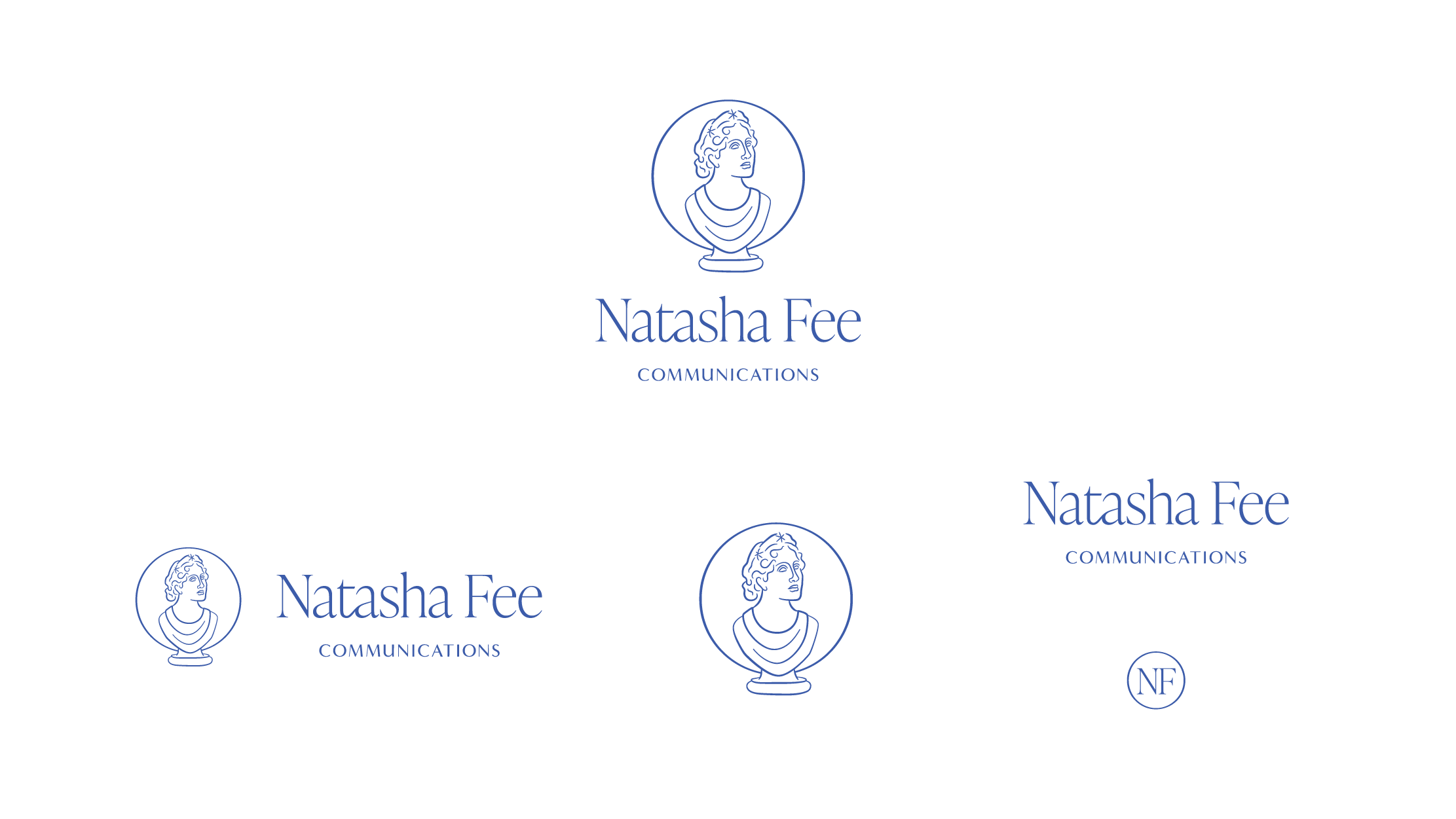
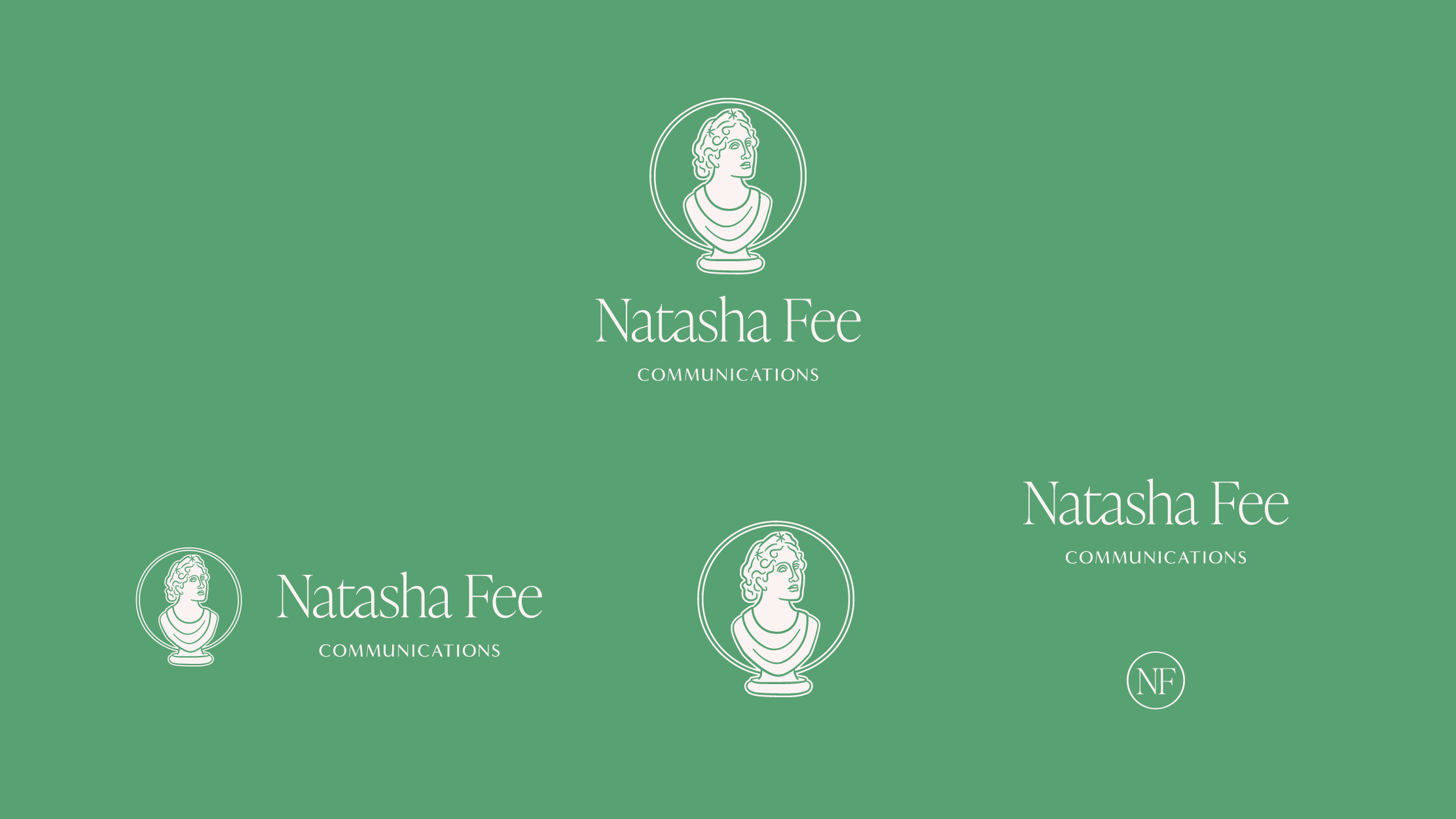
The Natasha Fee Communications logo system has a configuration for every context, from their website header to their Instagram avatar to their favicon. The white version in the set was designed to avoid any weird inverting of the illustration.
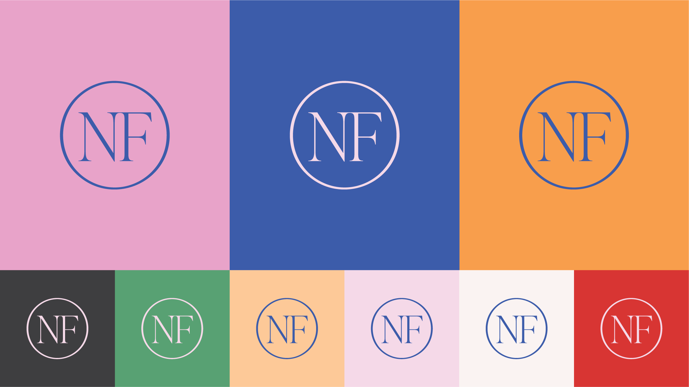
The color palette is fun and bright, while still being usable with a range of values from light to dark.
For typography, we opted for clear and legible typefaces, with a bit of a fun, casual hand, to add balance while still being cohesive. This was such a fun project and I can’t wait to see all the amazing work Natasha Fee Communications will bring into the world!

From Natasha Fee:
“Working with Sophie was a dream. I reached out to her for help designing a logo for my new business, without having put much thought into exactly what I needed. Through working with Sophie on the design process, she was able to help me crystalize exactly how I want to portray my business, not just through the logo, but through the entire presentation of my brand. Her brand design survey was incredibly thoughtful and thorough, and Sophie went above and beyond to ensure that I was happy with the direction we were moving in at every step. The logo and branding that she designed have far surpassed my expectations, and I am absolutely thrilled with the results!”
